Home/Excel tips/Create a progress chart that looks like a calendar and shows which days a task was completed
Create a progress chart that looks like a calendar and shows which days a task was completed
Create a progress chart that looks like a calendar and shows which days a task was completed
This week we're taking a look at how to build a calendar chart in Excel. It's part one of a two-part series.
Before we get started on charts, I wanted to quickly let you know about my free webinar called The Modern Excel Blueprint running daily this week!
During the training, you will learn about data analysis tools like Power Query, Power Pivot, Power BI, pivot tables, macros & more. I explain what these tools do, how they can save you tons of time by automating processes, and most importantly, how to become the Excel Hero of your organization.
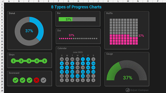
We've been looking at 8 ways to make progress charts.
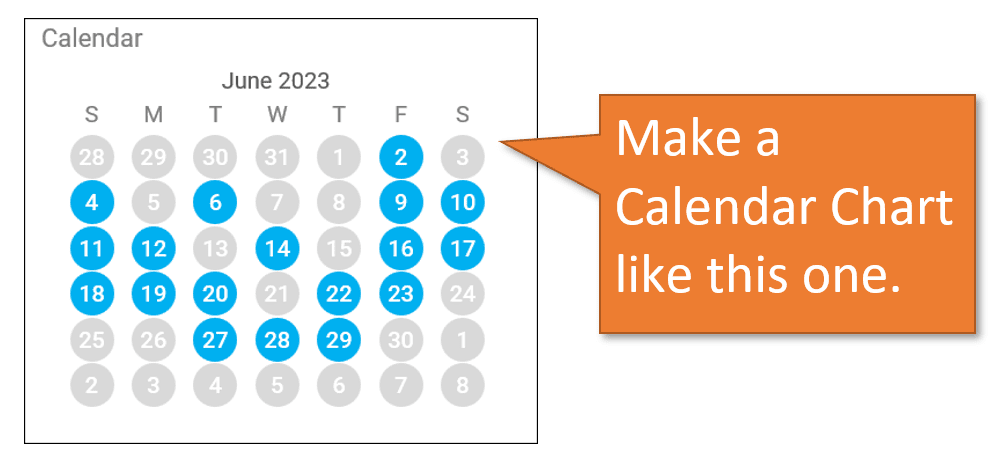
We started with Gauge Charts and Steps Charts. Now, I want to walk you through how to build a Calendar Chart, which colors in the days of the month when tasks are completed or progress is made toward a goal.
This type of chart is helpful for any type of personal habits, like tracking fitness goals. It's also great for business use. You can track attendance, sales goals, or other achievements that can be reached daily.
Creating a Calendar Chart
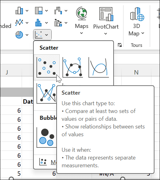
The calendar chart begins as an X-Y scatterchart. So start by selecting the X and Y data in the spreadsheet provided at the top of this post. With that data selected, go to the Insert tab and choose the first option in the Scatter chart menu, which is an X-Y scatter chart.
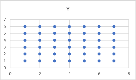
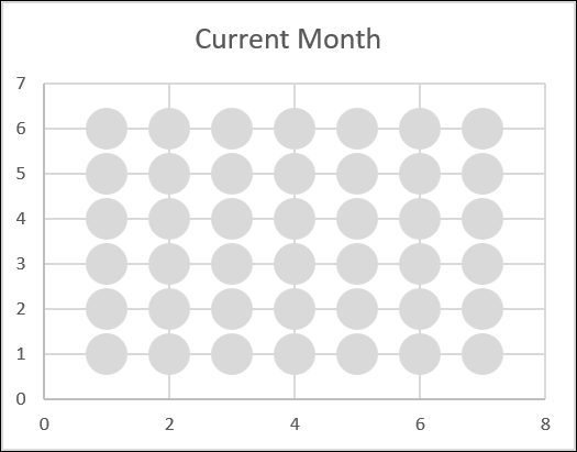
When you do, a chart like this will appear:
The X and Y data that we highlighted is what creates the 6 rows and 7 columns of the chart.
Format the Chart
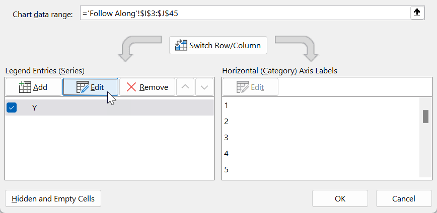
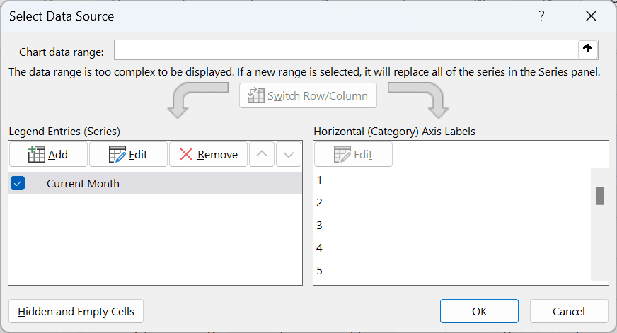
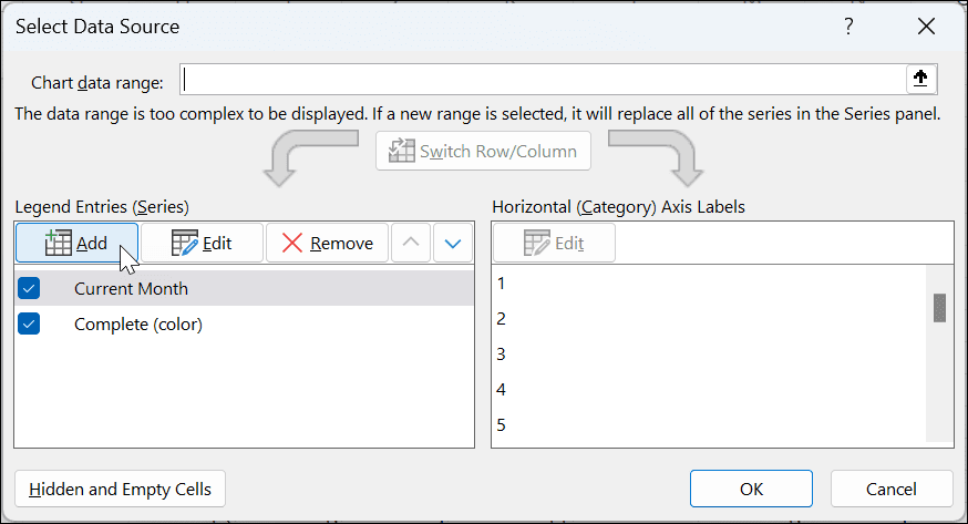
With the chart selected, go to the Chart Design tab and click Select Data. That will open up this window.
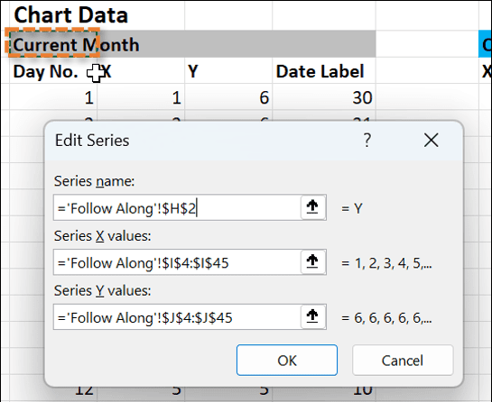
Click on Edit to rename the series by clicking on the cell that says Current Month.
Then hit OK.
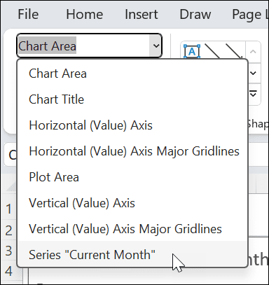
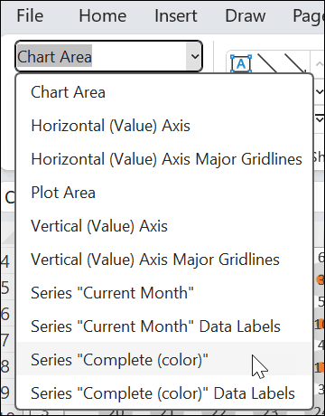
Now let's format the dots. With the chart selected, go to the Format tab and choose Series “Current Month” from the dropdown.
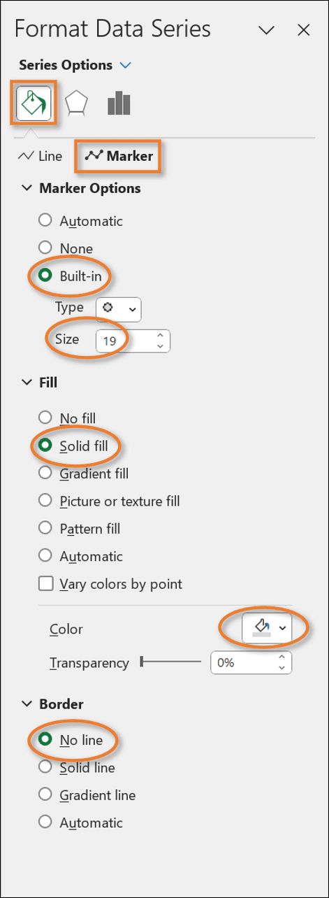
Then click Format Selection in the Ribbon to open up the task pane to the right of your worksheet. Under the Fill & Line options, go to the Marker section and choose the following options:
Marker Options: Built-In
Size: 19
Fill: Solid Fill
Color: Light Grey
Border: No Line
Your chart should be looking something like this now.
Add Data Labels
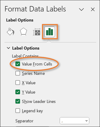
Next, we want to add the numbers to the dots representing the days of the month. With the chart selected, click on the plus sign (+) that appears near the right-top corner of the chart. Select Data Labels, and then More Options.
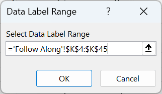
In the task pane on the right, go to the Label Options. Click the checkbox that says Value From Cells.
That will open a box for you to choose your data label range. Select the range from the Date Label column in the data.
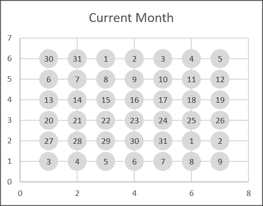
In the task pane, uncheck the boxes for Y Value and Show Leader Lines. You'll also want to Center the Label Position. Your chart will now look like this:
These data labels are dynamic. That means if I change the calendar start date, all of the subsequent dates for the month will be updated as well, thanks to the formula I've written in the data. If you want a separate post explaining that formula, let me know in the comments and I will create one.
Adding the Colored Days
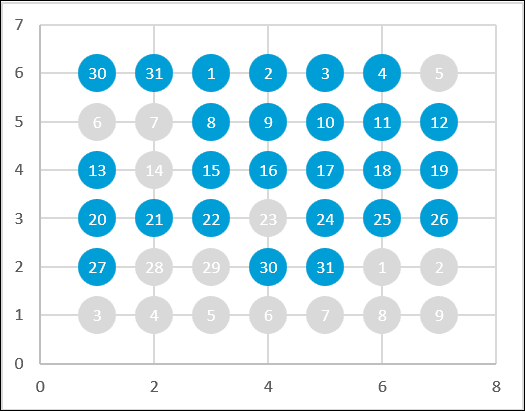
Now that we have the grey dots for each day of the calendar, we can overlay our colored dots for days where we want to show our progress.
In the data, I've used a COUNTIF formula to look for dates where we have entered “Yes,” indicating our goal for that date was met. If it finds a Yes, it will return the value equal to that date and plot a dot on that date in the chart. If it doesn't find a Yes, it will return an #N/A error and no dot will be plotted.
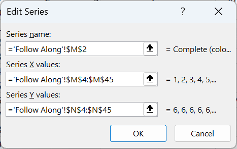
To add the colored dots, start by selecting the chart and going to the Chart Design tab. Choose Select Data. Then click the Add button in the Select Data Source window.
For Series Name, choose the cell that says Complete (color). The Series X values will be the range of data under the X. For the Series Y values, select the range of data under the Y.
Hit OK, and then OK again, and you will see that your chart has small colored dots overlaying some of the grey ones. We just need to format these dots.
Choose the Series “Complete (color)” on the Format tab.
Then, in the task pane, select all of the same options as before, but use a different color. Now your chart looks like this:
If you like, you can change the font color of the data labels to appear white instead of black.
Adding Days of the Week
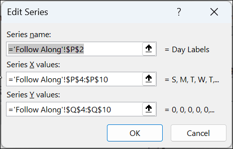
Now let's add initials for the days to the top of the chart. With the chart selected, go to the Chart Design tab, hit the Select Data button, and choose Add under Legend Entries.
For the Series name, select the cell that says Day Labels. The Series X values should be the data in the Day Label column. For the Series Y values, select the data in the Value column.
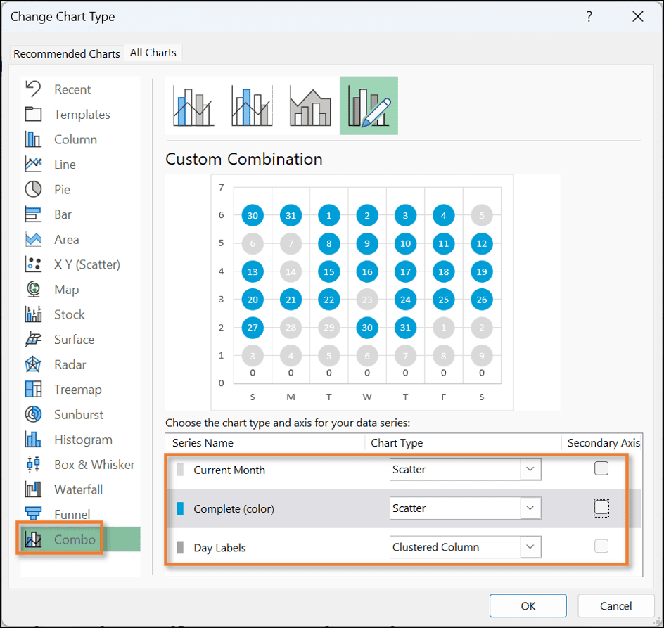
This doesn't look like it does much to the chart, but once we change the chart type, it will make more sense. With the chart selected, go to the Chart Design tab, and hit Change Chart Type.
In the Change Chart Type window, select Combo in the left menu, and then these settings:
Current Month: Scatter
Complete (color): Scatter
Day Labels: Clustered Column
You also want to uncheck any of the Secondary Axis boxes that are checked.
If, as in the image above, your chart shows zeros along the bottom, just above the Day Labels, you can click on that series and then uncheck the box for Data Labels to make them go away.
Your chart now looks like this:
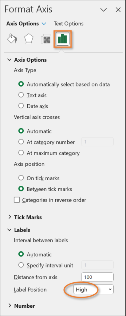
Moving the Day Labels
To move those days of the week to the top, select that data series and then choose the High setting for the Label Position in the task pane.
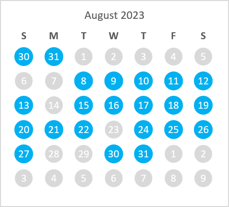
You can remove the Axes and Gridlines, and also the line around the chart, if you wish. Next, you want to add a chart title by checking the Chart Title box in the menu and then linking it to the chart title in the data. Here's your final result!
You are welcome to copy this chart and all of its data into your own workbooks so that you don't have to build it from scratch. When you do, you'll either have to adjust the data in the yellow columns or point the COUNTIF formula to your existing data, wherever it resides.
Conclusion
This is Part 1 of the Calendar Chart tutorial. In the next post, we'll learn how to make the chart interactive by adding a spin button for the months of the year, we'll look at some different styles for the chart, and we'll add a weekly goals feature.
What type of progress, tasks, or activities would you use this kind of chart for?Leave a comment and let me know! Questions and suggestions are welcome there too.
Hi, I'm Mr Z-Lib Admin of Z-Lib.click .Thank you so much and I hope you will have an interesting time with Z-Lib.click . Mail: webappninja1@gmail.com - PHONE : +84779313987. Learn More →


Leave a Comment