How to Create a Chart in Power BI
How to Create a Chart in Power BI
A well-crafted chart communicates information effortlessly to your audience. Luckily, creating a chart in Power BI is relatively easy.
You can create charts by simply dragging and dropping your visual on the canvas. Here are the different kinds of Power BI charts and how to create them.
Types of Charts in Power BI
Power BI offers a diverse range of visualization options. The good thing is that most of the graphs and charts in Microsoft Excel can all be created in Power BI. If you're unfamiliar with charts, you can get to know them by creating graphs and charts in Excel.
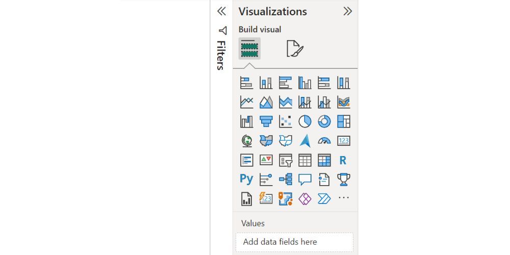
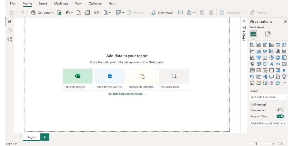
You can see the various chart types in the Visualization pane of your Power BI report. The chart types in Power BI include area charts, line charts, bar and column charts, combo charts, pie charts, cards, decomposition trees, ribbon charts, scatter charts, doughnut charts, maps, and much more.
1. Import Your Data into Power BI
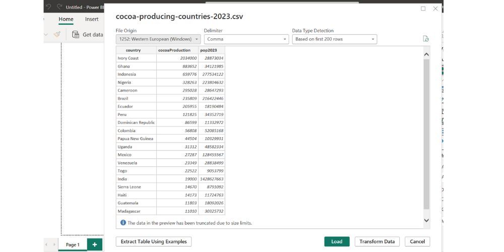
You need to import your data before you can create charts in Power BI. If you haven't prepared your data yet, you can practice with data from websites that provide free data. In our case, we'll work with data on Cocoa production by country. You can download this dataset in CSV format from the World Population Review website.
Once you have your data, you'll need to load it into Power BI. Here's how you can do that:
- Open Power BI.
- Click on the Home menu.
- Click on the Get data option and select Excel.
- Locate and select the file from your local directory.
- A preview of the data will be displayed in Power BI Navigator. Select Load Data if you are satisfied with how the file looks.
If you're unhappy with the data, you can use Power Query to clean and transform the data. Luckily, the sample data in our case is in good condition.
2. Create a Bar Chart in Power BI
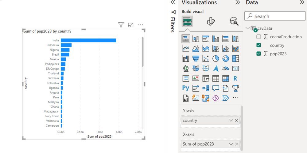
Regardless of the chart type, the process of adding a visualization to your Power BI canvas is the same. Let's create a bar chart in Power BI to kick things off. Once you've loaded your data, follow the steps below:
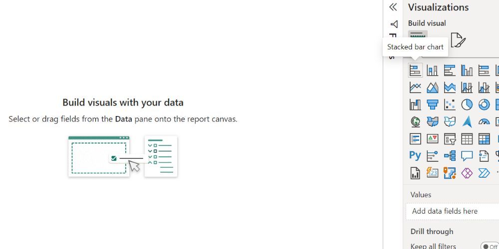
- Head to the Visualization pane.
- Click on the stacked bar chart visual from the Visualization pane.
- Drag and drop the country column from the Data pane into the Y-axis field.
- Similarly, drag and drop the pop2023 column from the Data pane into the X-axis. This will automatically populate the bar chart with data.
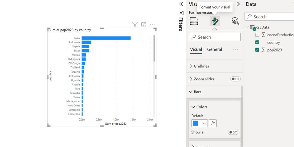
- Click on the Format Your Visual icon to customize your charts.
There are plenty of ways to customize your chart. For instance, you can change the color of the bar chart under the color option of the Bar drop-down arrow.
3. Create a Pie Chart in Power BI
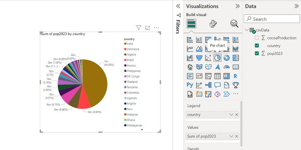
Pie charts are effective for illustrating proportions within your data. You can create a pie chart using the same approach:
- Select the Pie chart visual from the Visualization pane.
- Drag and drop your country column from the Data pane into the legend. This represents the data keys for the visual.
- Drag and drop your pop2023 column from the Data pane into the value option. This will populate the pie chart.
Create Powerful Charts in Power BI
Power BI empowers you to take your visualization game to the next level by offering impressive visuals and features. With Power BI, you can craft aesthetically appealing and interactive reports while giving your audience a better understanding of the data.
This level of interactivity transforms raw data into compelling, easy-to-understand visual stories that can maximize your data's potential.




Leave a Comment