Create Excel Waterfall Chart – Step by Step
A waterfall chart in Excel is a great way to visualize running totals making it super easy to understand how addition and subtraction of values affected starting value and how we reached the final figure. Creating waterfall chart in Excel is not a complex feat anymore with this tutorial!
Income statement or Profit or Loss Statements are accountants’ everyday job. Whether you are assessing past performance, current or even forecasting, great chances are that you have make this financial statement.
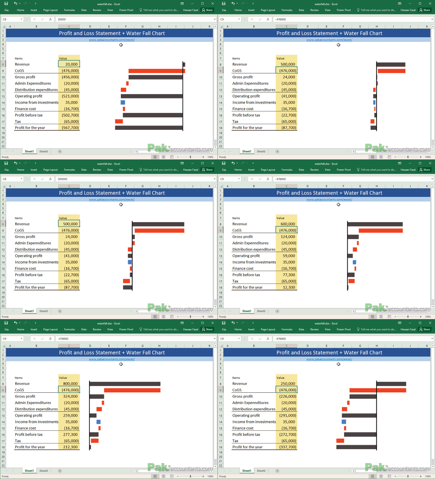
It does a pretty neat job in putting all the important numbers in a format. But numbers are numbers and most of the time require experience to understand how each element is interacting and affecting the overall profitability. But what if we can make it visual? Meaning that we transform it into a graphical representation that adds meanings to numbers immensely and make it understandable even to non-accountants? Have a look at the following Income statement and waterfall chart combo:
And this is what we are learning today Excel lovers! Not sure if it is called horizontal waterfall chart or vertical waterfall chart. I think it is horizontal as it has elements plotted against x-axis. But anyways whatever the category is I want this to go with the income statement numbers on the left or right and this chart accompanying those numbers to make it much more visually appealing and understandable. And it can definitely go in Excel dashboards! We will see that soon!
Create Excel Waterfall Chart – Step by Step
Step 1: Download this Excel workbook it will help you with basic income statement data that we need to make waterfall chart.
Once the file is open we need to prepare the data that will feed the chart. This will take some time and patience to do it correctly. But it isn’t this complicated that you throw in the towel just yet. Trust me!
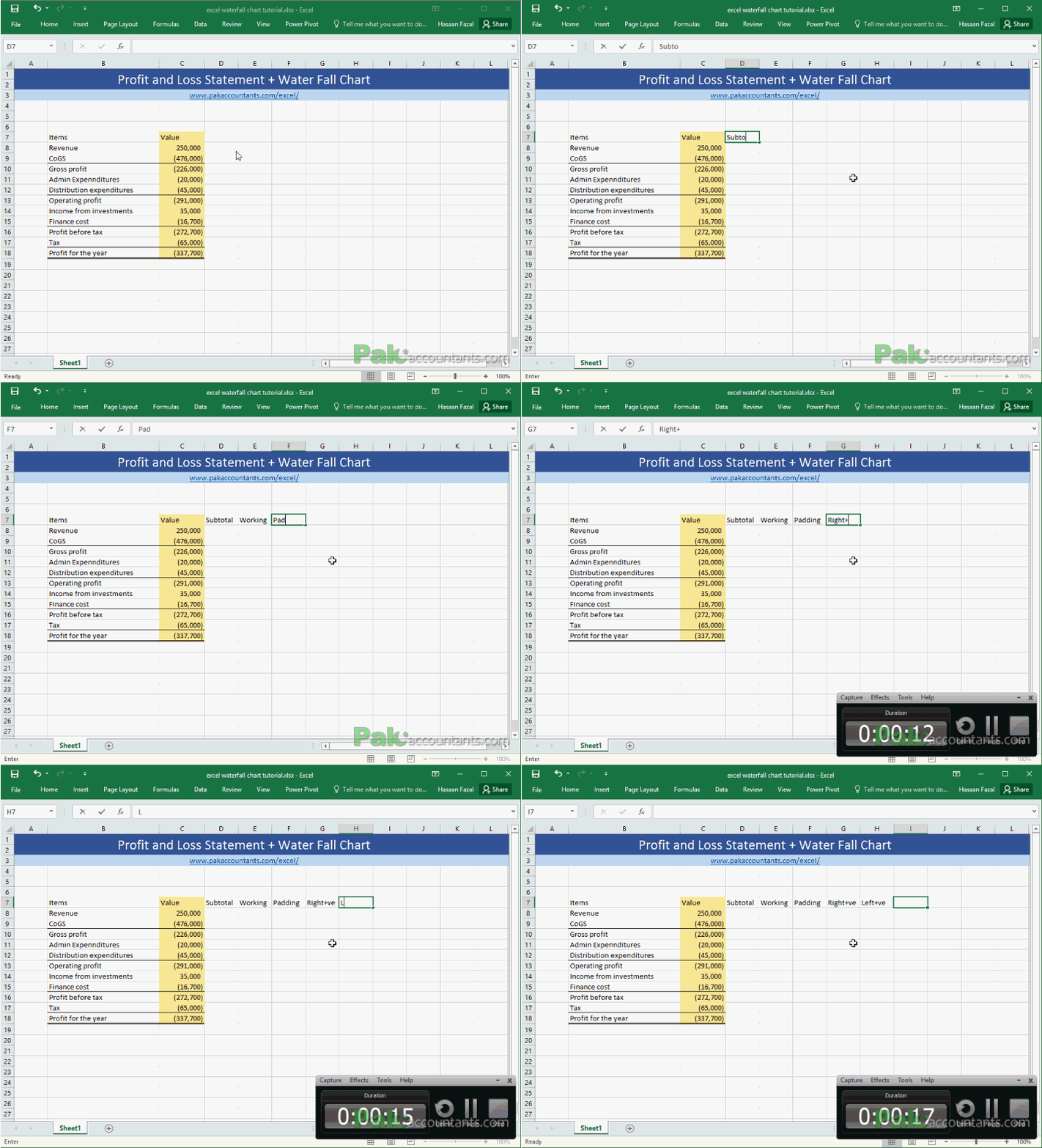
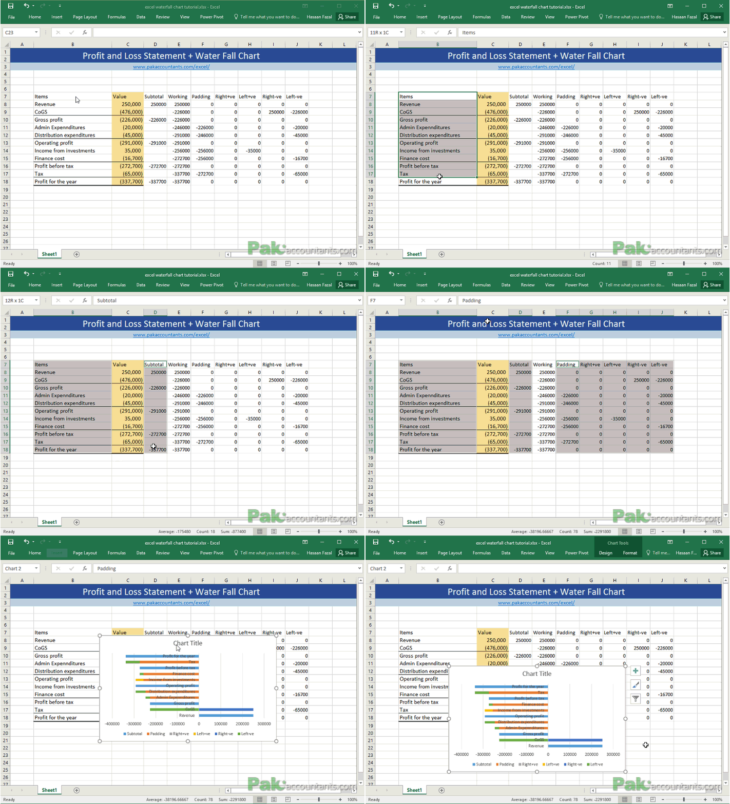
Step 2: Go to cell D7 and Name it as “Subtotal”. And the respective cells as follows:
E7: “Working”
F7: “Padding”
G7: “Right +ve”
H7: “Left +ve”
I7: “Right -ve”
J7: “Left -ve”
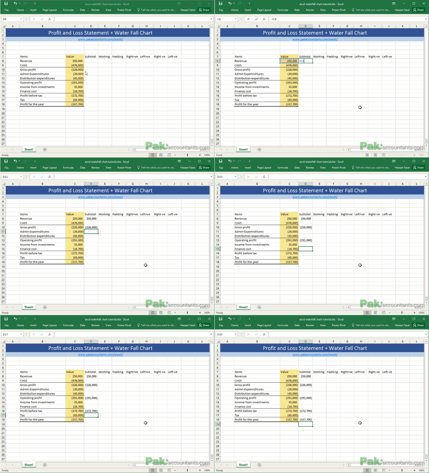
Step 3: In subtotals column you will have to work manually to mention which of the figures from the report are not income/expense items rather subtotals. So simply mention the cell reference after equal sign to link the cell to appropriate subtotal including the revenue.
Step 4: Go to cell E8 and put this formula:
=IF(D8<>"",D8,SUBTOTAL(9,C$8:C8))
This formula is simply checking if D8 is empty then make a cumulative total as we go down the column from cell E8.
Once copied in the appropriate cell press enter and drag the fill handle to fill the range.
Step 5: Go to cell G8 and put this formula and press enter followed by dragging the fill handle down to fill the range:
=IF(ISBLANK(D8),IF(OR(E8<0,C8<0),0,MIN(E8,C8)),0)
Step 6: In cell H8 insert the mentioned formula as follows and fill the range by dragging the handle:
=IF(ISBLANK(D8),IF(AND(C8>0,E8<0),-C8,IF(AND(C8>0,E8>0,E8<C8),-(C8-E8),0)),0)
Step 7: And in cell I8 put the following:
=IF(ISBLANK(D8),IF(AND(C8<0,E8>0),ABS(C8),IF(AND(C8<0,E8<0,E8>C8),ABS(C8-E8),0)),0)
Step 8: And one more in the last column that should go in cell J8:
=IF(ISBLANK(D8),IF(E8>0,0,IF(AND(C8<0,E8<0),MAX(C8,E8),0)),0)
Step 9: Now the last bit but very important one that will actually make the chart a waterfall chart and that is “padding”. Go to cell F8 and put the following formula:
=IF(OR(D8<>"",AND(G8<>0,H8<>0),AND(I8<>0,J8<>0)),0,MIN(ABS(E7),ABS(E8))*SIGN(E8))
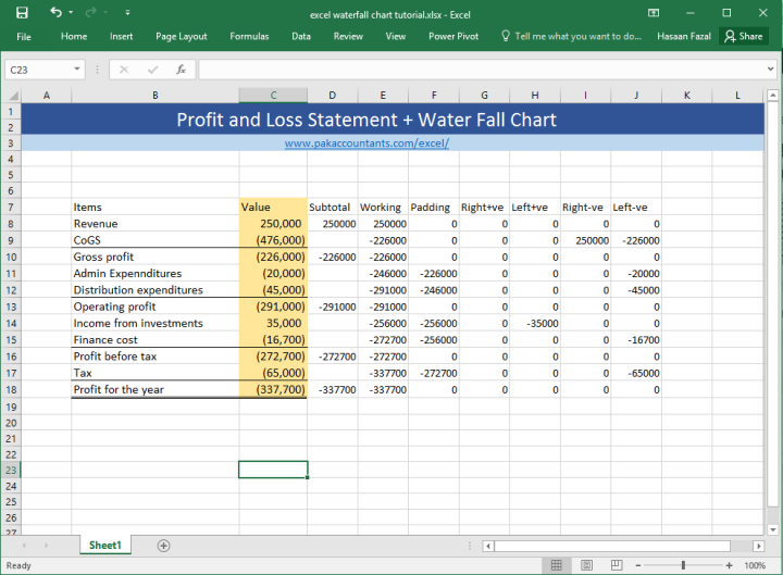
Once you are done your worksheet should look like this:
Right so we have the real meat of the problem all chopped and minced and now its ready to grill!
Step 10: Select the Items column and then Press and Hold CTRL key on the keyboard and select the subtotal column, padding column, and the last four columns Right+ve, Left+ve, Right-ve, Left-ve.
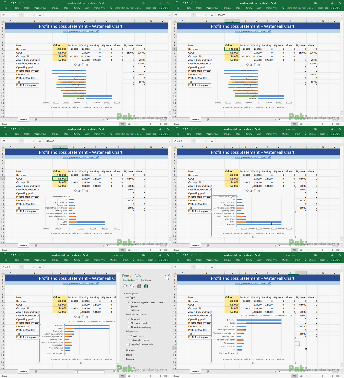
Then click Insert tab > chart group > bar charts > click stacked bar charts and you will have the following ugliness vomited over the worksheet. Don’t worry we will fix it!
Step 11: To make chart editing easy, change the revenue figure from 250,000 to 600,000. Left click chart title and hit delete to get rid of it. Next having chart selected right click on y axis labels and select format axis. Under axis option check mark the “Categories in reverse order”. Close the sidebar for now
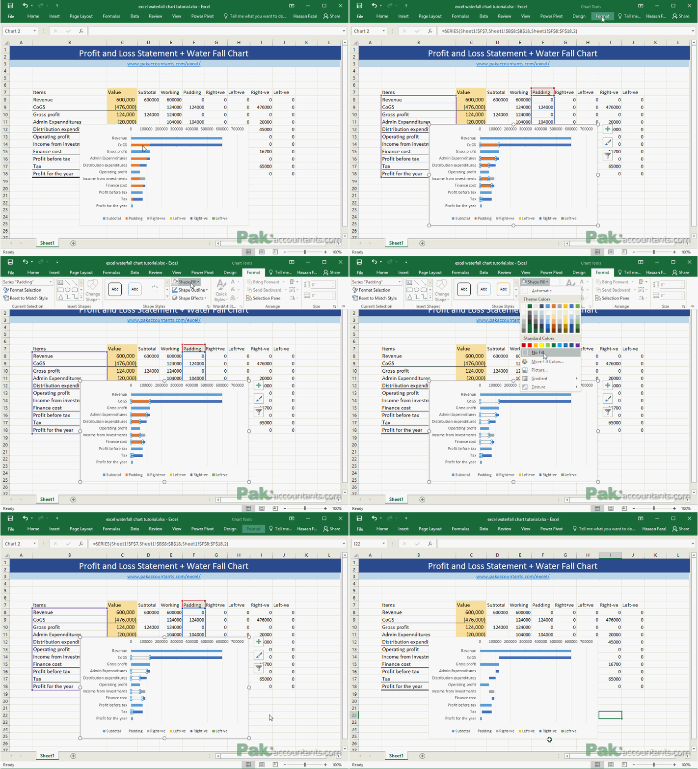
Step 12: Left click on padding series (you will be able to guess it via legend at the bottom). Go to format > click shape fill > select no fill. See the waterfall chart coming together? We just need to make few change in Excel to complete it.
Step 13: Right click on any bar and select format data series option. I made the gap to be 30%
Step 14: Got rid of legends and x-axis labels by simply select and deleting them.
Step 15: Next I hid the y-axis labels by going to axis options and under label tab > select none from label position
Step 16: Just to make the Y axis more visible I simply clicked on it and under Fill and Line options I increased the width and changed the color to solid black. Having this axis in waterfall chart is essential to let excel users understand if the running balance has shifted to negative/loss or staying in positive/profit side.
Step 17: As there are four series of data “working” as two you might have to color the relevant series in similar colors by selecting them and changing shape fill under format tab. For that you might have to play with revenue figure a little so that both ends are exposed
Step 18: Lastly simply select anywhere empty in the chart and under Fill and under border options select no fill and no line. To hide the data underneath simply select the data and hit CTRL+1 and under custom format enter “;;;” and click OK.
Adjust the width and height of chart and you are all set to impress! In the end I gave it a personal touch and turned grid view off to make it look cleaner. The best thing about this dynamic waterfall chart is that it maintains itself within the specified range and spreads the points on chart by shifting the vertical axis left and right. Hence dynamic vertical waterfall chart is born! Told you creating waterfall chart in excel isn’t that difficult!
Loved creating waterfall chart in Excel? Pin it!




Leave a Comment