
6 best charts to show % progress against a goal
6 best charts to show % progress against a goal
Back when I was working as a project lead, everyday my project manager would ask me the same question.
“EVBA, whats the progress?”
He was so punctual about it, even on days when our coffee machine wasn’t working.
As you can see, tracking progress is an obsession we all have. At this very moment, if you pay close attention, you can hear mouse clicks of thousands of analysts and managers all over the world making project progress charts.

So today, lets talk about best charts to show % progress against a goal.
Please download example file and keep it handy while reading the rest of this tutorial.
Data for these charts
For all these charts, we will use below data:
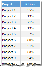
Chart #1: Conditional Formatting Icons + % values
This is my all time favorite. It is very easy to implement and works really well.
All you have to do is,
- Select the % completion data
- Go to Home > Conditional Formatting > Icon sets
- Select 3 traffic lights
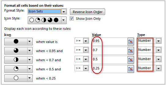
- Edit the rule as shown below:
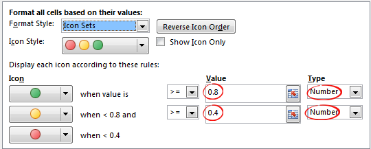
- Done!
Why you should use this?
- Very easy to set up.
- Scalable. Works the same when you have 20 or 200 or 2000 items to track.
- Looks great
Keep in mind:
- The traffic lights in Excel are not great for color-blind people.
- The traffic lights do not look good when printed in black-and-white (or gray scale)
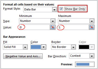
Chart #2: Conditional Formatting Data Bars
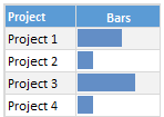
Another easy and quick answer.
- Select % completion data
- Go to Home > Conditional Formatting > Data bars
- Select Solid Fill if available.
- Done!
- Extra step: Adjust maximum bar size to 100% so that you can see relative progress better.
Why you should use this?
- Very easy to set up.
- Scalable. Works the same when you have 20 or 200 or 2000 items to track.
Keep in mind:
- By default the maximum value in your data takes 100% of the cell width. So make sure you set this to 100% for better depiction of progress.
Chart #3: In-cell bar charts
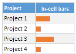
If for some reason you cannot use databars, then rely on in-cell bar charts. These are simple to setup and works great in many situations where conditional formatting may not be an option.
- Assuming your % data is in A1,
- In adjacent cell (B1), write = REPT(“|”, A1*100)
- You will get a lot of pipe symbols | in this cell.
- Select the cell and change font to Playbill
- Adjust font size and color if needed.
- Done!
Why you should use this?
- Very easy to set up.
- Scalable. Works the same when you have 20 or 200 or 2000 items to track.
- Can be handy when making dashboards or reports (where conditional formatting may have limitations)
Keep in mind:
- The font & size has impact on how in-cell chart is displayed. Use either Playbill or Script fonts.
Chart #4: Pies
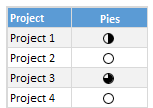
Conditional formatting pie charts are a simple alternative to show % progress data.
The process is same as traffic light icons. Make sure you adjust pie icon settings as per your taste.
Why you should use this?
- Very easy to set up.
- Scalable. Works the same when you have 20 or 200 or 2000 items to track.
Keep in mind:
- Pie chart icons have only 5 stops. So they are not really pies.
- Not everyone likes pie charts. Make sure your boss / customers dig them.
Chart #5: Color scales or heat maps
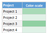
When you have a lot of items to track, your focus is really on which items are lagging (or leading). In such cases, a color scale (also known as heatmap) can work very well. It colors cells based on their value. For example, the darker a cell color is, the more that particular project is done and vice-versa.
Why you should use this?
- Very easy to set up.
- Scalable. Works the same when you have 20 or 200 or 2000 items to track.
Keep in mind:
- Make sure the color starting & end points are well contrasted. Else the color scale looks bland.
- By default color scales show the values too. To hide them use ;;; custom cell formatting code.
Chart #6: Thermometer charts
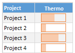
This is my favorite technique. It works very well for data like this.
Why you should use this?
- Easy to understand
- Scalable. Works the same when you have 20 or 200 or 2000 items to track.
Keep in mind:
- If any value is more than 100% the chart may not explain it properly.
- Make sure the axis min & max are set to 0 and 1 respectively.
- You need a dummy column with 100% in it to show outline of thermometer.
Download Examples
Click here to download example workbook. It contains all these charts.
Special bonus for you:
As a bonus, the download workbook also has 5 step tracker to make you awesome in Excel. Go ahead and download now.
What is your favorite chart to show % progress?
My most favorite chart is thermometer. The next is traffic light icon-set.
What about you? Which of these 6 is your favorite? Please share your chart in the chart. If you use something else altogether, please tell me. I am eager to learn from you.
#evba #etipfree #eama #kingexcel📤How to Download ebooks: https://www.evba.info/2020/02/instructions-for-downloading-documents.html?m=1


Leave a Comment