Create Simple Dial Charts in Excel – How To
Create Simple Dial Charts in Excel – How To
Charting or graphing is one of the biggest punch Excel has. Visual presentation of data greatly improves user’s ability to comprehend the information and significantly cuts down the time to take decisions. That is why executives around the world rely on charts and graphs rather than simple reports full of words. Believe me nobody has time to read. Show them!

This is the first take on charting from my side but I don’t want it to be too simple a tutorial. So we will not only learn how to make a chart but also how to choose between different types of charts and then modifying the pie chart to make a very simple looking dial chart.
Basic Idea with Basic Data
Excel Tutorial Workbook
For the purpose of following tutorial and to best apply the technique discussed download this excel workbook and follow the steps mentioned below
I have a simple data in hand. Usually sales department settle targets for the month and at certain of the week monitor the achievements. Sales manager mostly set benchmarks to track the progress. With the same idea in mind we have the data of sales target and actual sales achieved so far in terms of target with variance. All figures are expressed in percentages.
Target figures and actual figures are provided by us where as Variance figure gets calculated on its own as we have a formula in that case which as follows:
=ABS(B2-B1)
Variances can be negative or positive but for our chart we need a positive value in all the cases therefore we have wrapped the difference of two values in ABS function (absolute) to give us the positive value in all the cases.
With a little more tuning to pie charts or dial charts we can make speedometer charts but this is for the future 

Making your first Pie Chart – Yummy!
We have a very minimal data. Just three items. Target, actual and variance. All three in percentages. To make a chart follow these steps:
Open the file you downloaded.
Step 1: Select the data using Ctrl+A or using mouse.
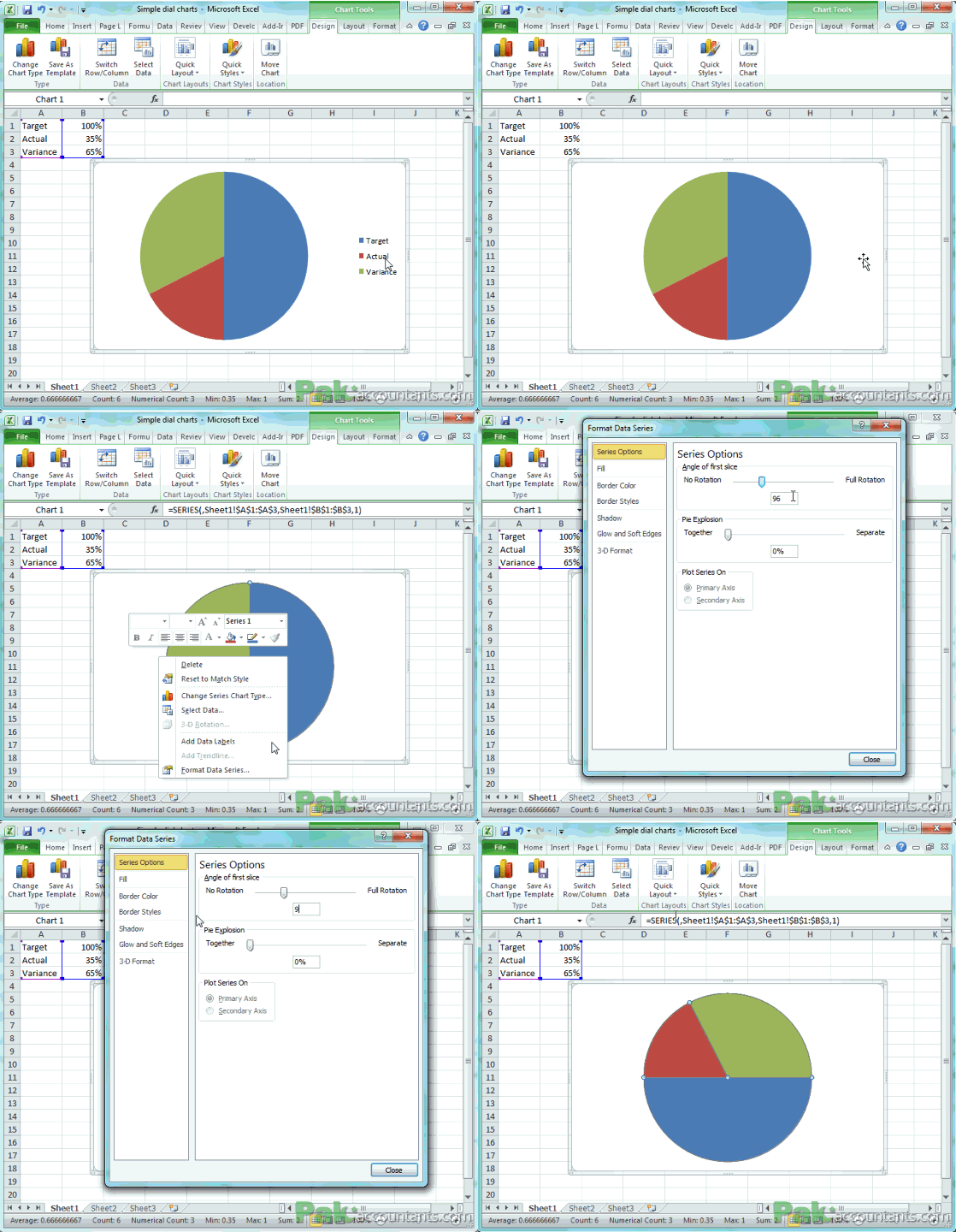
Step 2: Go to Insert Tab > Charts group > click Pie drop down > Select the very first pie chart in 2-D Pie. You will get your pie chart instantly.

You can see a pie chart in three colors with target, actual and variance plotted and on the right legends of what each color represent. Time to modify it according to our requirements.
Step 3: Click legends once and press delete key.
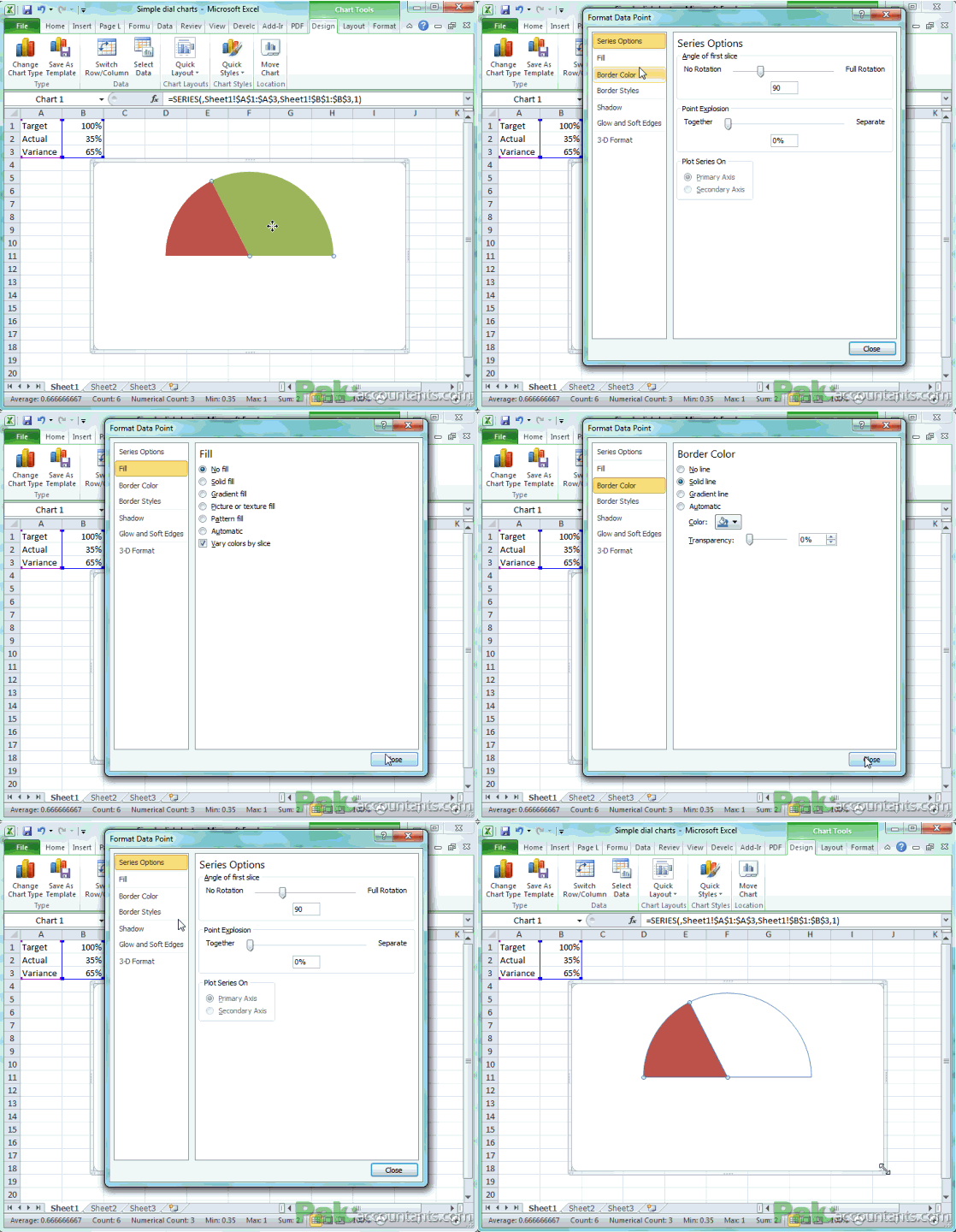
Step 4: Click the pie once, all three quadrants will be selected. Right click and from the menu select format data series.
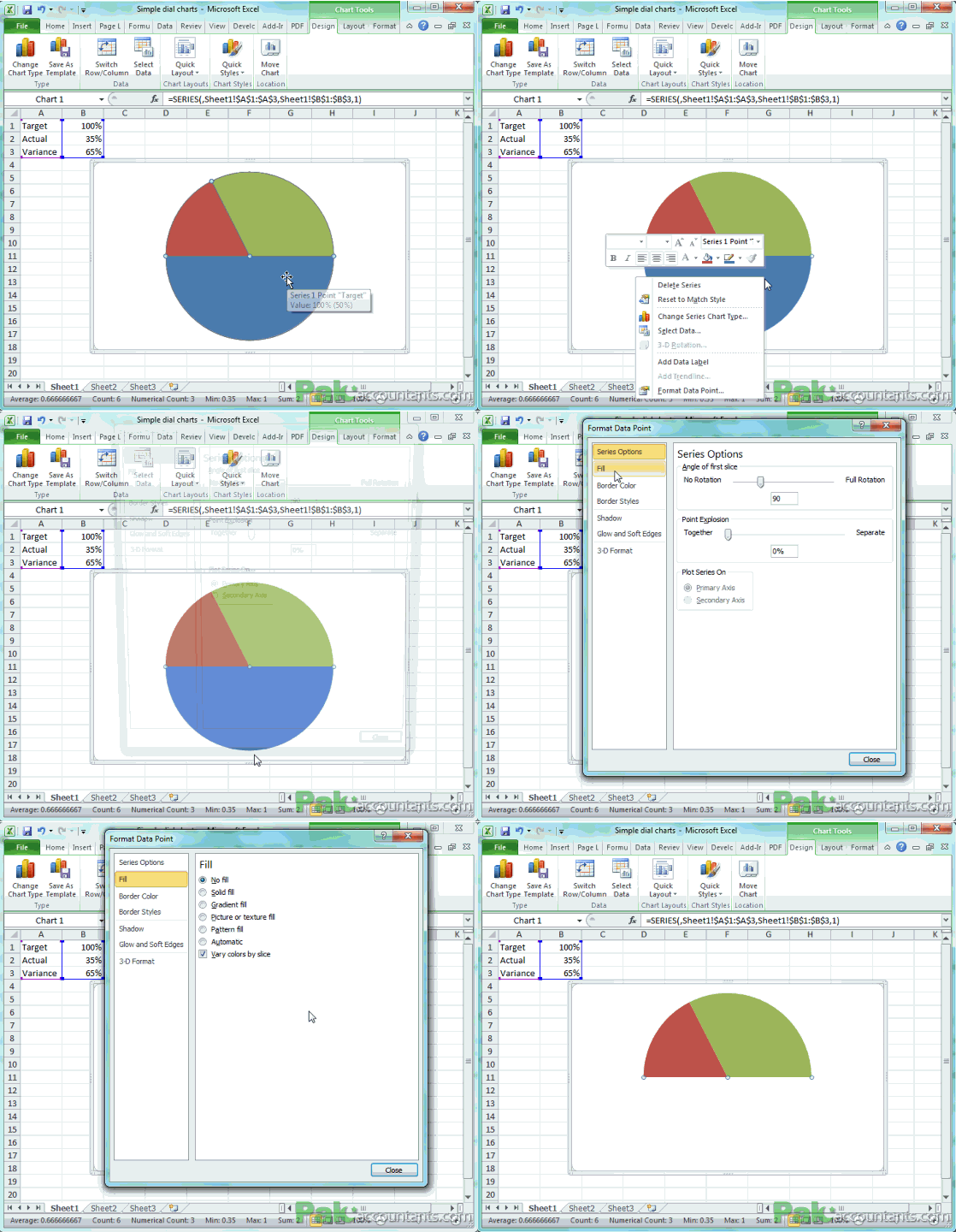
Step 5: Make sure Series options is highlighted. On the right under “angle of first slice” move the handler so that a color filling half of the pie itself goes under and the other two colors show above that half. In my case I had to move it by 90 degrees. Click Close button.

Step 6: Click the blue portion once and now you will notice that only that part is selected. Right click again and from the menu select format data point.
Step 7: Click Fill on the left and from the right select no fill radio button. Click Click close. Now you notice that you can see only half of the pie.

Step 8: Click the portion at the right > right click > select format data point. Click Fill and select no fill radio button. Click Border color and select solid color. Click Close
Step 9: Click the only visible portion > right click > select format data point. Click border color and select sold color. Click Close

Done! 

Now change the actual value and watch the dial moving.

You have just excelled to a new level. Congrats!
Do you use charts in Excel? For what purpose you use them and how? If you have any trick up your belt let me know in the comments box below
#evba #etipfree #eama #kingexcel📤How to Download ebooks: https://www.evba.info/2020/02/instructions-for-downloading-documents.html?m=1


Leave a Comment