
Creating Excel charts with Subcategory axis – [Quick Tip]
Creating Excel charts with Subcategory axis – [Quick Tip]
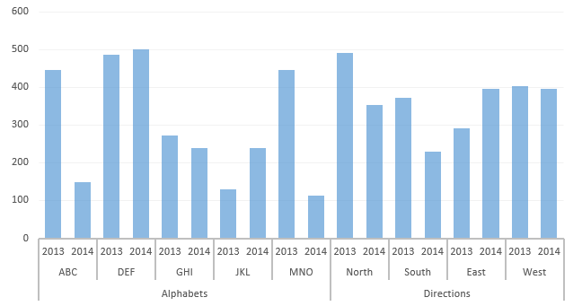
This is definitely a neat trick. Usually we have single X-axis chart element. But you can have multi-category axis to show the information in a much more arranged manner. Following is what we are after. You can observe that it has three categories, one main and two subcategories stacked up on each other in a bar chart:
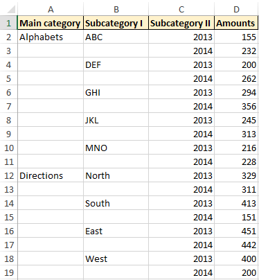
Believe it or not, the process to have axis divided in several categories is really not that daunting. What you all need to do is to arrange the data in appropriate categories. The following data arrangement shows how it needs to be before it can be used for subcategory charts:
Pointer to note is that you don’t have to fill the cells down representing each category or subcategory.Once you have the data arranged. Simply select the whole data set. And insert the chart as normal. And DONE!
Following animation walks you through the process of insert multi category chart in excel worksheet
So all in all the data arrangement itself will take time to arrange. Once in place everything is all set to plot!
Don’t forget to checkout more of our tutorials on Excel Charts
#evba #etipfree #eama #kingexcel📤How to Download ebooks: https://www.evba.info/2020/02/instructions-for-downloading-documents.html?m=1


Leave a Comment