How to Make a Chart or Graph in Excel
How to Make a Chart or Graph in Excel
While making a presentation to your clients or group of people, only presenting texts and figures aren’t attractive. Texts are necessary but visual representations make it even better. Microsoft Excel has pictorial representations like Chart or Graphs. They are excellent for statistical presentations which have a great recall value than mere statistical figures.
But, how do we make a charts or graphs in Excel? Everyone is not adept at using Excel that well. But, there’s nothing to worry about. Here’s a step-by-step guide to deal with it.
Are Charts and Graphs the Same?
It may seem so but technically they are a bit different. How they are different? To understand it, we need to understand the charts first so that we can understand the difference better.
Charts in Excel:
Charts are much easier to understand as compared to Graphs. There are certain types of charts available in Excel which is used to represent share, percentage, difference, segments, divisions or parts. In simple words, a chart conveys the information graphically.
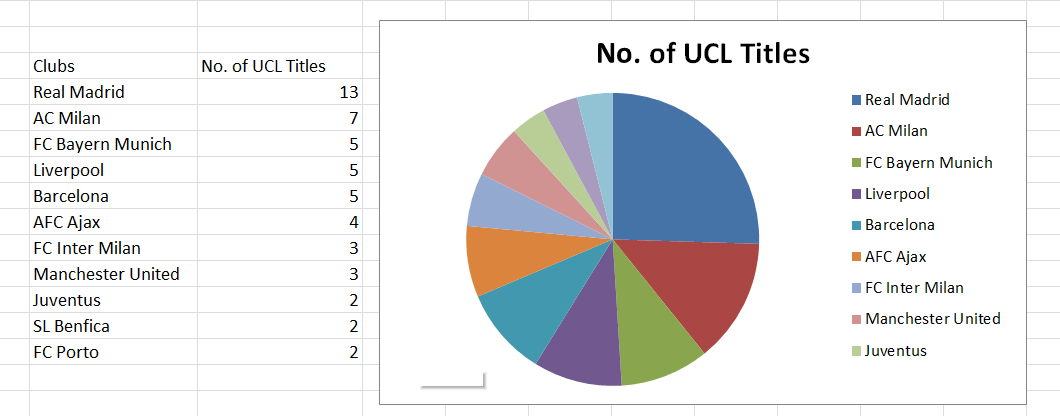
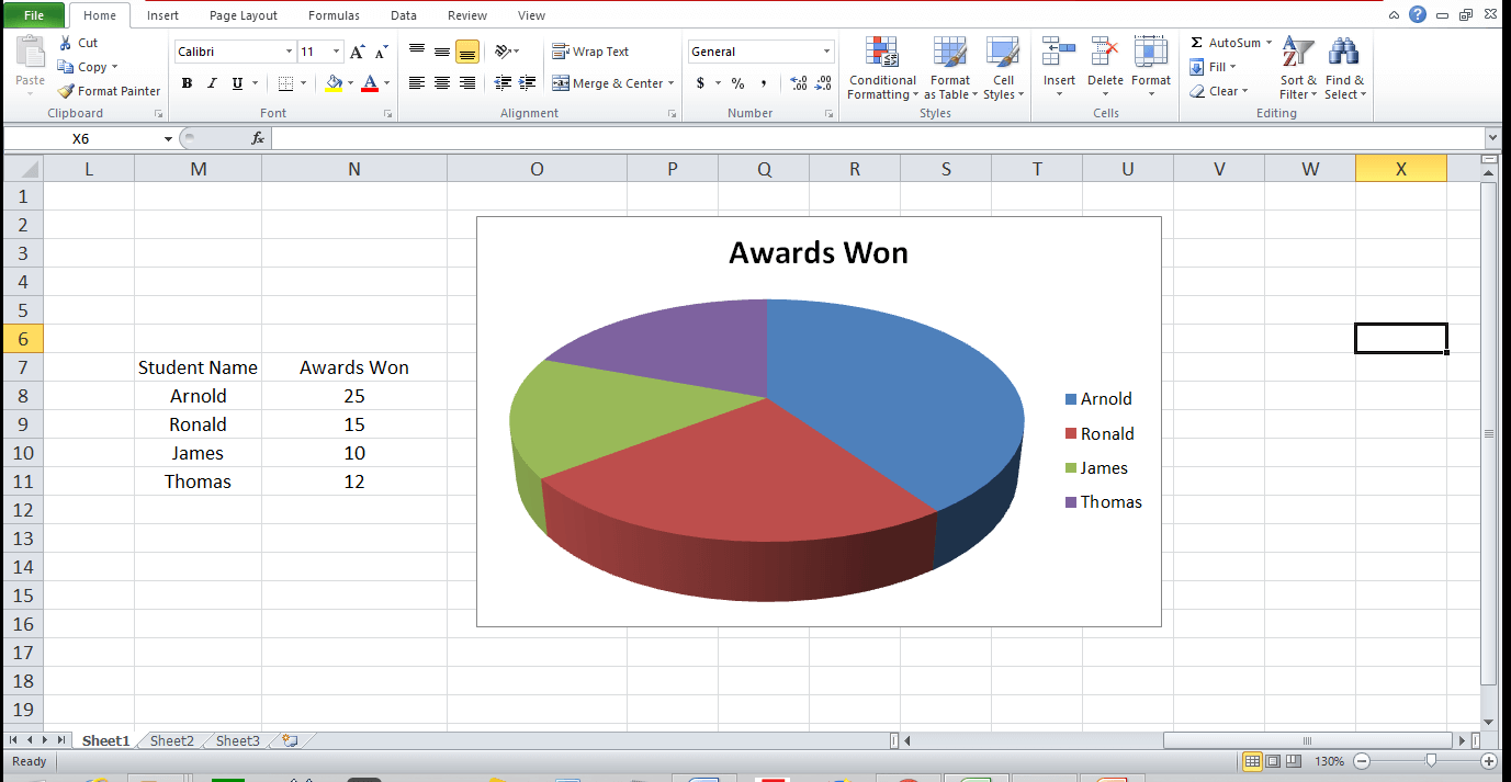
For example: Below is a graph which represents the number of UCL Titles won by major Football Clubs. On the LHS you can see tabular form & RHS there’s a Pie Chart representing it. You can also get percentage related charts. For statistical analysis or comparison, Charts are better because they give a clear idea about it.
Graphs in Excel:
Graphs usually differ in showcasing them. They represent changes or fluctuation in values in a specific span of time. They are also easy to create & use, when it comes to comparing different parameters.
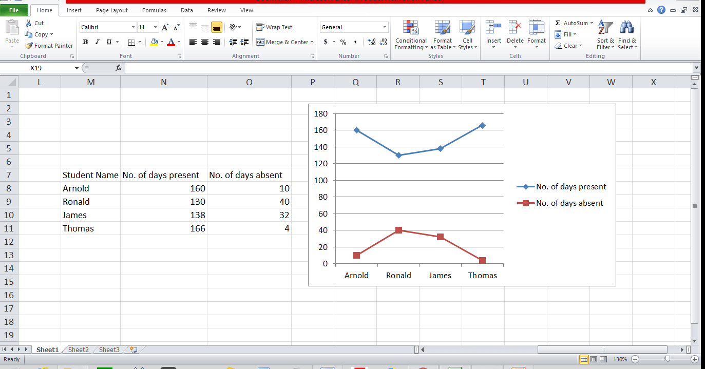
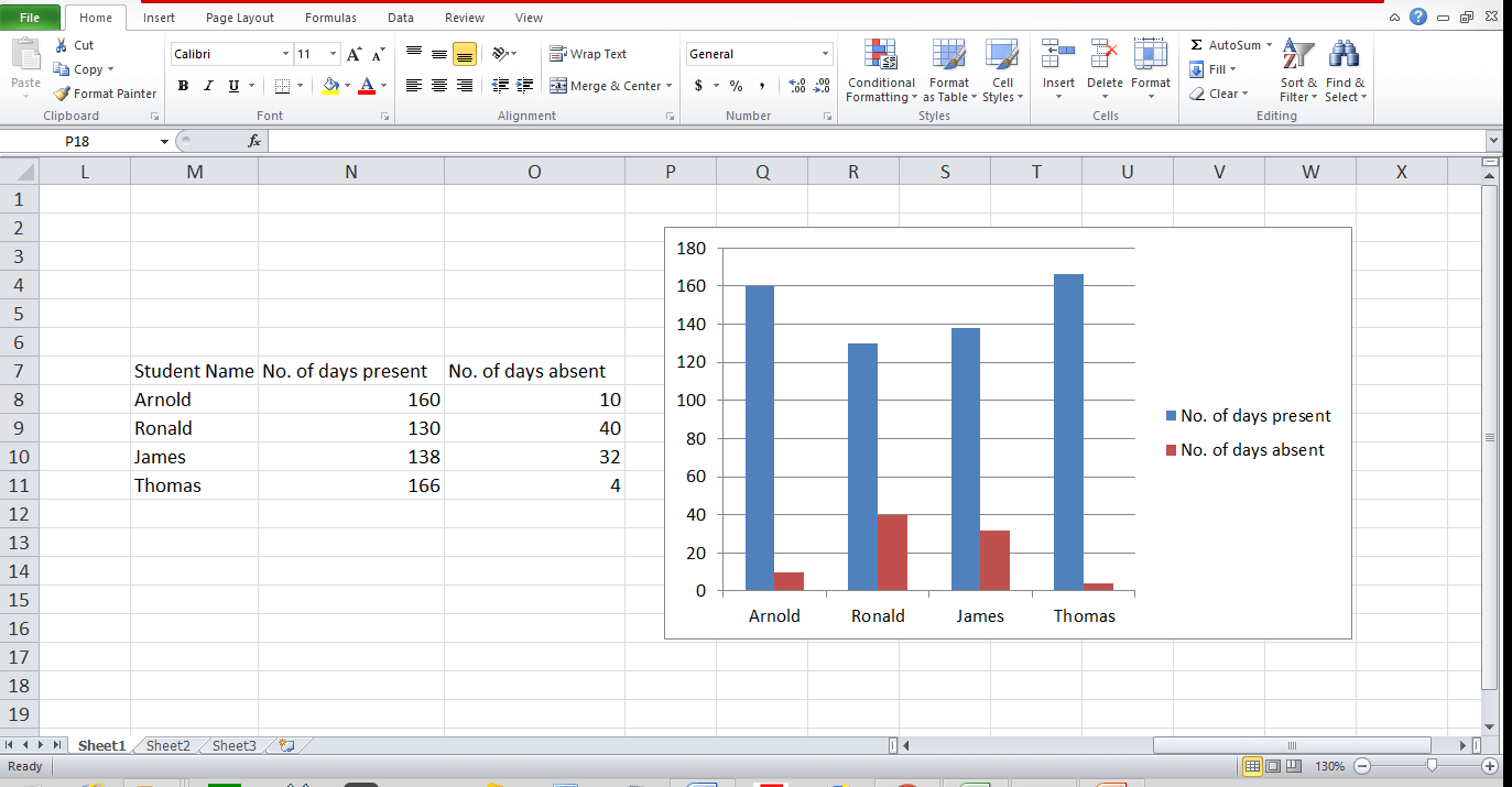
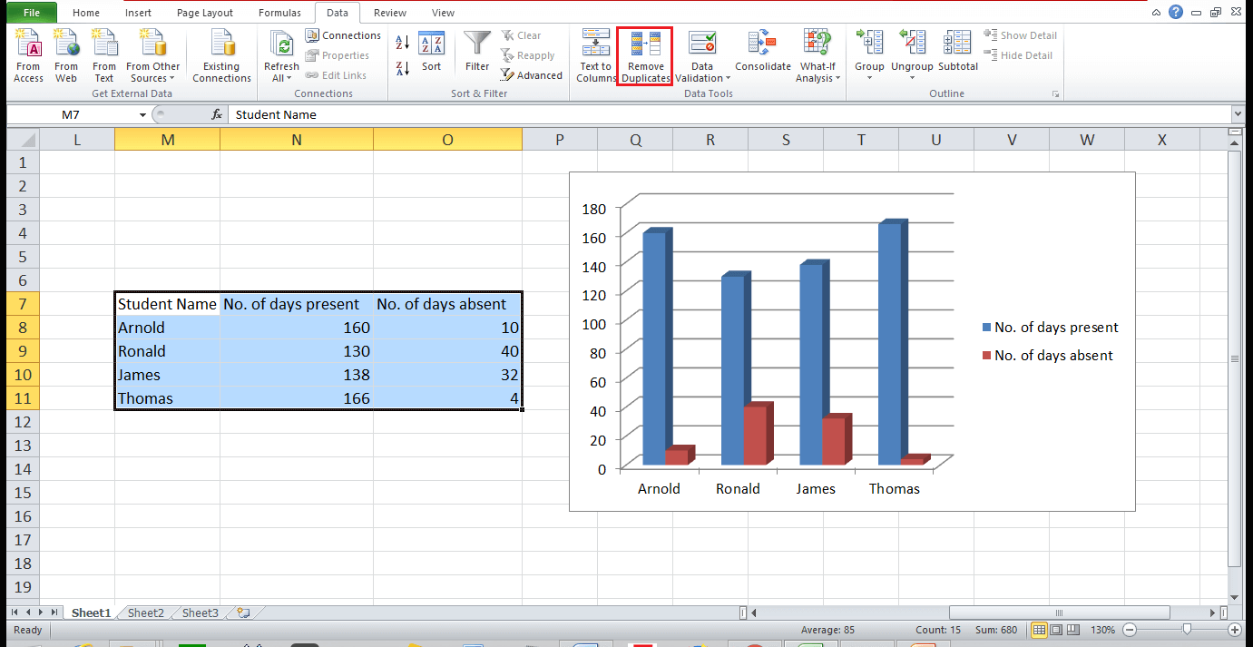
However, understanding it might be still confusing for some. For example, we show below a comparison between 4 students regarding attendance. Just by looking you might have got an idea of each student easily. Graphs are also used in Business to compare their ups & downs.
Types of Graphs:
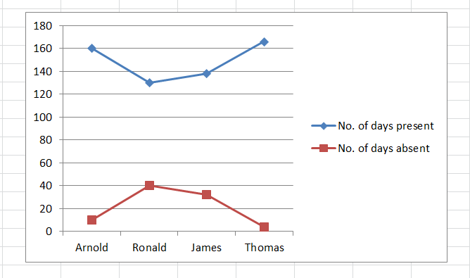
Line Graphs: Line Graphs basically represent data in a linear format. These lines can be 2-D or 3-D. You can plot any data with more than 1 parameter in line graphs. For example, average work hour, students’ marks, profit & loss, etc.
Column Graphs: Column Graphs are another comparison tool. We all have drawn column graphs while in school or college. However, we may not have gone for the 3-D ones. Column Graphs have 2 axes, X & Y. You can use multiple parameters here too but be sure about the colors used. Because plotting multiple parameters with a wrong color may become confusing.
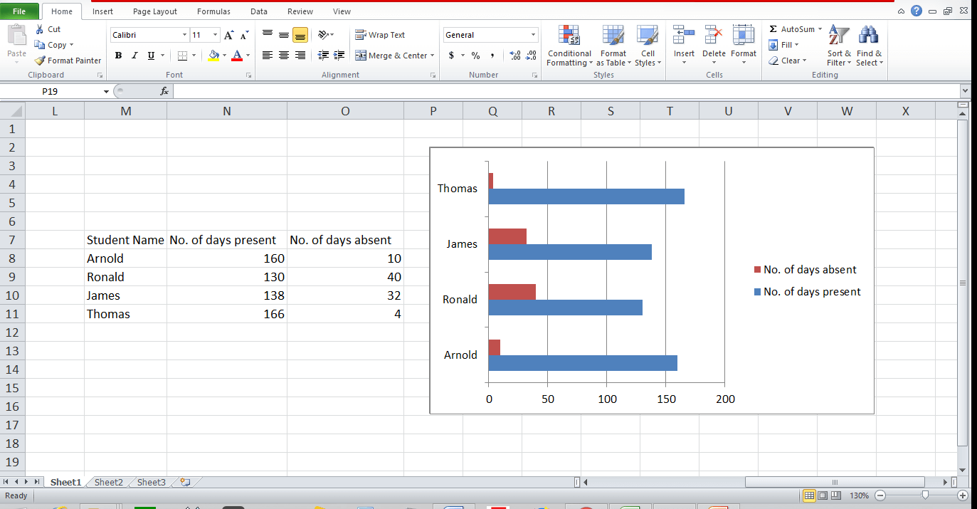
Bar Graphs: Bar Graphs are same like Column. The only difference here is alignment. In Bar Graphs, parameters are assigned on the Y-Axis & variables on X-axis.
How to Make Graph in Excel?
Enter your data on an Excel sheet in tabular form:
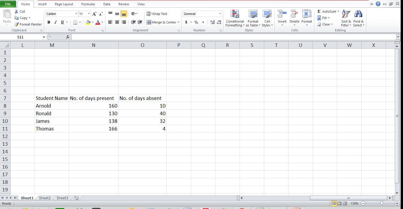
Firstly, in order to make a Graph in excel, you need to insert your data in Excel. Just make a table and enter data in the respective rows & columns.
Excel work on 2 major components: Rows that are horizontal ones & Columns that are Vertical ones. For example, we need to make a graph of time taken by freelancers to complete a particular work. Here we will complete each freelancers time taken & create a graph accordingly.
Now, considering 1st column for Freelancer name & 2nd column for the time taken, we will make a table. You can also create graphs for more rows & columns. So, let’s make a simple one.
Select the type of graph of your choice:
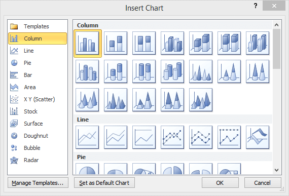
Once you have made the statistics table, you will have to select the type of graph. Each type of graph is suitable for different task. Like, 2-D Line graph is best for comparing fluctuation or multiple things. Meanwhile, column ones are best for simple yet attractive representation.
Select your data you want to make graph of by dragging your mouse. Highlight your data by selecting it from start to end. Here I have selected from Student Name till 4.
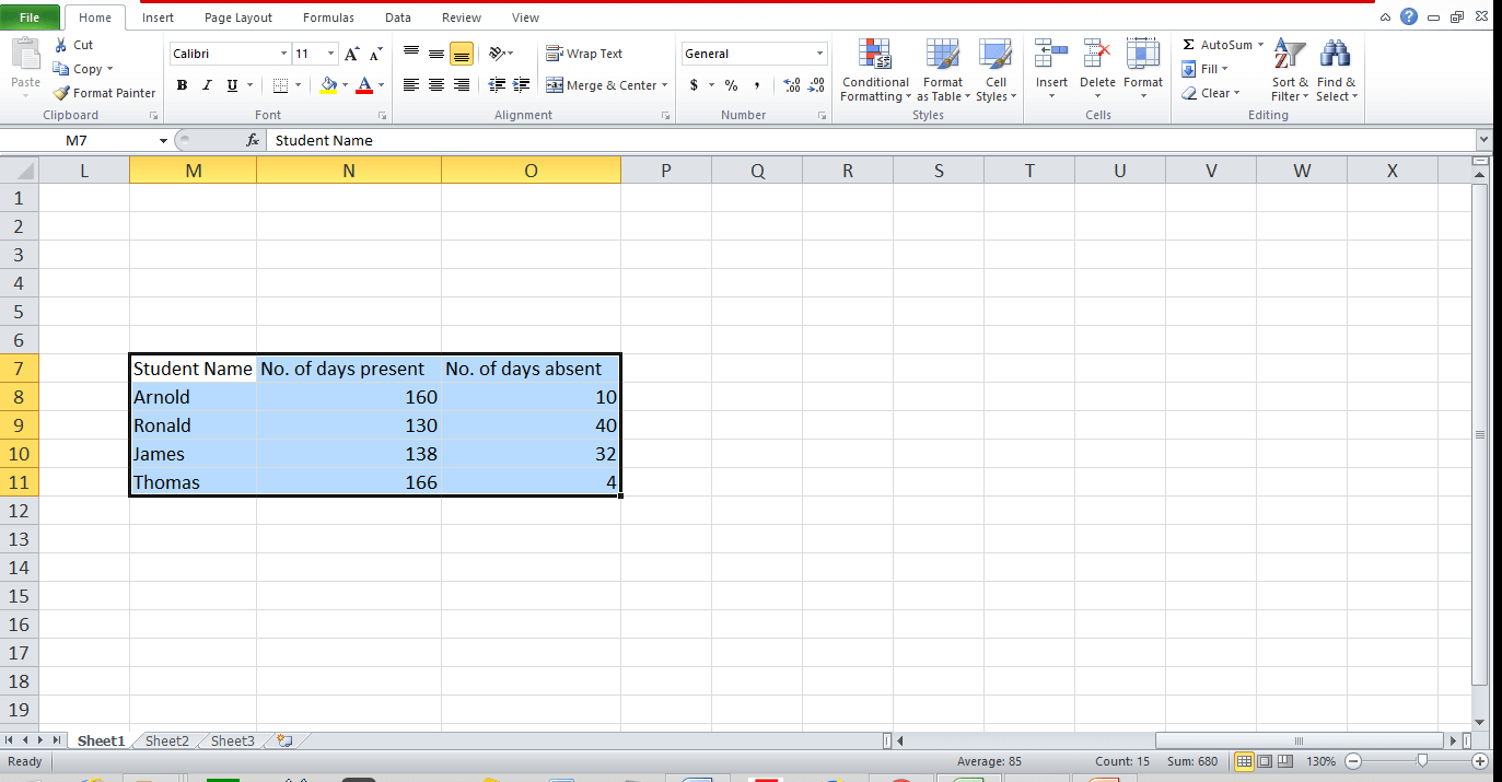
Now go to ‘Insert’ which will be on Ribbon. The ribbon is set of function like Home, Insert, Page Layout, etc. And, functions like Font, Graph, Chart, are the subset of it. Under the Insert tab, click on the type of graph you want to pick. In this example, I have selected Column Graph.
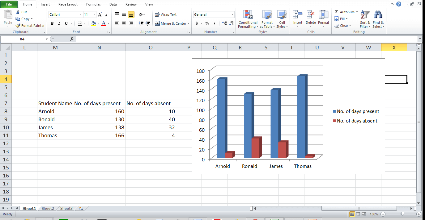
Edit your graph if you want:
Following the previous steps has built your graph. Now, You can change or edit as per your needs on things like Axis, Color, Layout or Title.
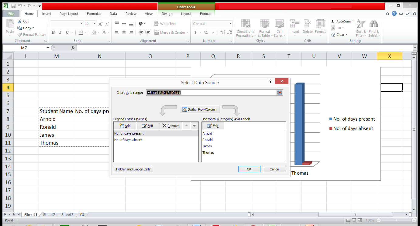
Axis Change: Right Click on the graph > Click Select Data > Click Switch Row/ Column > OK!
Axis Change: Right Click on the graph > Click Select Data > Click Switch Row/ Column > OK!
Color & Layout: Click on the bar graph > Chart Design > Select a suitable one for Chart title, axis title & legend. To format something, just click it to open Format Windows.
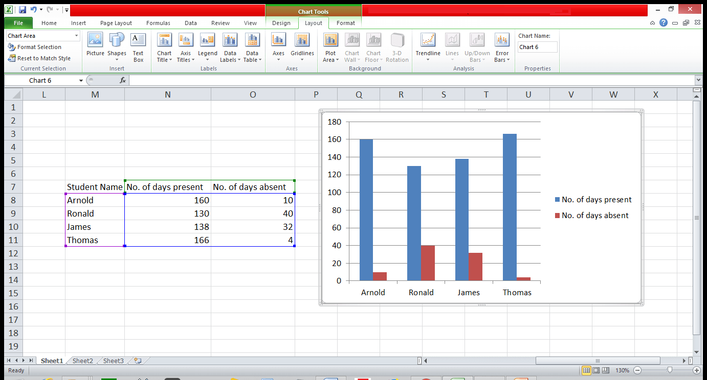
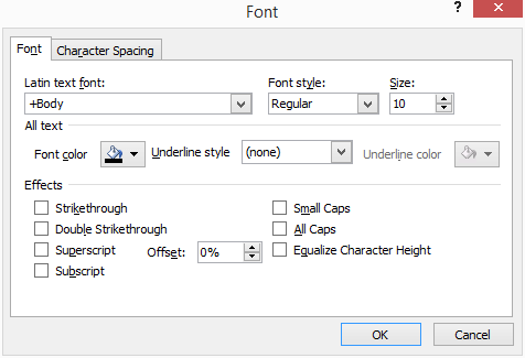
Size of Chart Legend & Axis Labels: Click each > Go to Home Tab (in Ribbon) > Select Font type & size to make graph bigger or smaller respectively.
Improve your Excel Graph with Tools:
To improve a graph & make it more attractive, you can simply use its inbuilt tools. Just click on the graph & go for the following ones:
Design: Using Graph, you can reposition your graph & change its type. You can also change the transitions.

Layout: Using Layout, you can change axis title, title & position of the legend. Additionally, change of Axis is also possible in Layout. Adjust grid lines, plot area, trend line, bars, error bars, everything within few clicks.

Format: Using Format, you can add border to your graph. Additionally, add colors according to you. Make sure colors should not be confusing when integrated with the graph.

How to Make Chart in Excel?
Charts & Graphs follow similar steps. You just need to select Charts in place of Graphs. Graphs have 3 basic types but Charts have more than 4 types excluding its subtypes.
You can make every possible change in Chart which you can in Graphs. Tools for improvement are the same for both. Charts & Graphs look similar but they are fractionally different. Charts can be presented in the shapes of Pie, Area, X Y, Scatter, Radar, etc. Even though they both are having the same creation procedures, there are little different.
Difficulties faced in Excel while making Charts & Graphs:
Sorting Data might be problematic while creating charts & graphs. You should sort your charts or graphs first, to make it accurate. But sorting data sometimes make things difficult because not everyone can sort correctly. Sometimes, you need to remove duplicates if you have g data gathered data from a 3rd party source.
Usually copied content are unfiltered and might affect your Charts & Graphs. You can use “Remove Duplicates” option in Data Ribbon in Excel.
This option will find the duplicate information &ask you which ones to remove. Eventually, the best option is to remove Duplicates & solve sorting issues.
📤You download App EVBA.info installed directly on the latest phone here : https://www.evba.info/p/app-evbainfo-setting-for-your-phone.html?m=1


Leave a Comment