
Conditionally Format Chart’s Background in Excel – How To
Conditionally Format Chart’s Background in Excel – How To
Excel charting is in the air for last few weeks and we are learning some really cool tricks on making charts better looking and also fulfilling the purpose. Today we will learn how to make Excel charts with background that changes with the change in certain condition.
And this is what I got with my attempt on the same requirement:

This technique require no VBA and even no conditional formatting limitations like keeping the chart at one place or not changing chart dimensions etc:
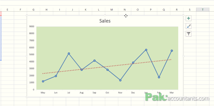
So it is really cool. So lets do it!
Download Basic Excel Tutorial file
Click here to download the Excel tutorial file that contains basic data and will help you to follow the steps discussed in this tutorial
Step 1: Open the tutorial workbook you just downloaded.
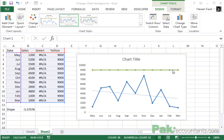
Step 2: Go to cell B14 and put this formula:
=SLOPE(B2:B12,A2:A12)

Step 3: Go to cell C1 and make a heading Green and in cell D1 Yellow.
- Go to cell C2 and put this formula:
=IF($B$14>0,9000,NA()) and double click the fill handle - Go to cell D2 and put this formula:
=IF($B$14<0,9000,NA()). Double click the fill handle to populate the cells with the same formula.

This will help us in getting the background conditionally colored depending on the data.
Step 4: Select the range in columns A to D. Go to Insert tab > Line chart > Line with markers. This will insert the chart.

Step 5: Having the chart active go to Design > Add chart element drop down button > Trendline > linear. A dialogue box will appear to ask for what series you require trend line. Select sales and click OK.

Step 6: Remove the unwanted chart items like labels and lines by selecting them and hitting delete button.

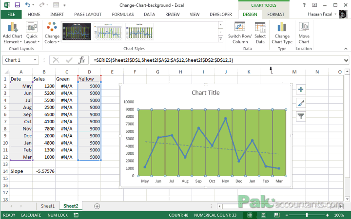
Step 7: Right click on the green line appearing at the top and from the menu select change series chart type.
Step 8: For green and yellow select stacked column chart type.
Step 9: Right click on green bars and select format data series. And reduce the gap width to 0%
Following animation will walk you through above steps:
Step 10: To change the color of background to your liking, having the chart active go to format tab > current selection group > select green series from the drop down menu and change the fill color. Same way, select the yellow series and change the fill color you like.
With few more cosmetic changes this is what we have:

Now change the value of March to see the effect instantly. Pick a number that decreases the trend like 5000

📤You download App EVBA.info installed directly on the latest phone here : https://www.evba.info/p/app-evbainfo-setting-for-your-phone.html?m=1


Leave a Comment