
How to build a pivot table on a map in Excel

3D Maps lets you see five dimensions: latitude, longitude, color, height, and time. Using it is a fascinating way to visualize large data sets.
3D Maps can work with simple one-sheet data sets or with multiple tables added to the Data Model. Select the data. On the Insert tab, choose 3D Map. (The icon is located to the right of the Charts group.) If you have Excel 2013 you might have to download Power Map Preview from Microsoft to use the feature.
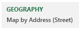
Next, you need to choose which fields are your geography fields. This could be Country, State, County, Zip Code, or even individual street addresses.
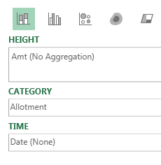
You are given a list of the fields in your data set and drop zones named Height, Category, and Time.
Hover over any point on the map to get details such as last sale date and amount.
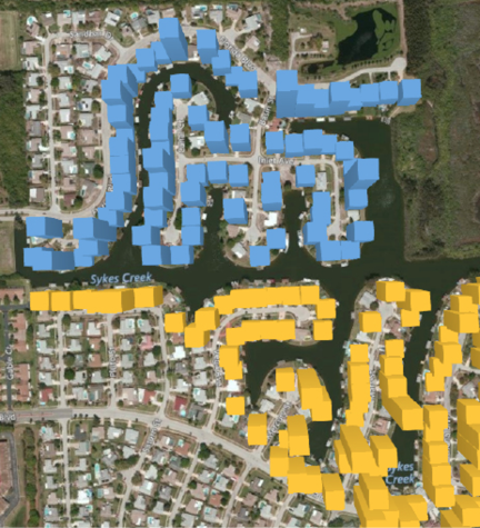
In the default state of 3D Maps, each data point occupies about one city block. To be able to plot many houses on a street, select the Gear Wheel, Layer Options and change the thickness of the point to 10%.
To get the satellite imagery, open the Themes dropdown and use the second theme.
3D Maps provides a completely new way to look at your data. It is hard to believe that this is Excel.
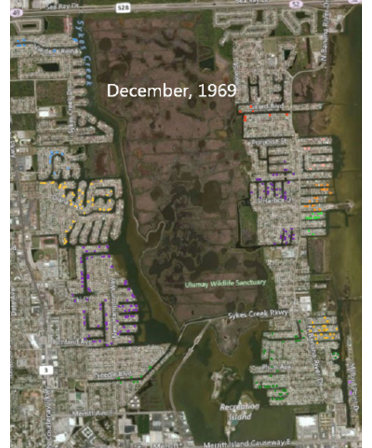
Here is a map of Merritt Island, Florida. The various colors are different housing allotments. Each colored dot on the map is a house with a dock, either on a river or one of many canals dredged out in the 1960s and 1970s.
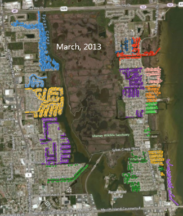
Using the time slider, you can go back in time to any point. Here is the same area at the time when NASA landed the first man on the Moon. The NASA engineers had just started building waterfront homes here, a few miles south of Kennedy Space Center.
Use the wheel mouse to scroll in. You can actually see individual streets, canals, and driveways.
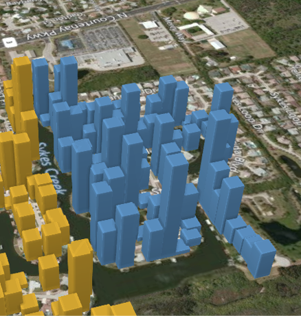
Hold down the Alt key and drag sideways to rotate the map. Hold down the Alt key and drag up to tip the map so your view is closer to the ground.
📤You download App EVBA.info installed directly on the latest phone here : https://www.evba.info/p/app-evbainfo-setting-for-your-phone.html?m=1


Leave a Comment